


This is the first installment in a series dedicated to debunking one of the oldest fashion myths there is: that Parisians don’t wear color. Today, we’re starting with the Frenchest of all colors: le rouge! 🇫🇷 I felt the subject deserved a proper introduction given our recent collective excitement around color, but feel free to skip straight to all the red street-style goodness!
Mesdames et messieurs, have you heard? Color is back! Move aside, color snobs, because the colorful girls are back en pleine force, ready to take revenge on the last few years of clean-girl dressing that had us (almost) convinced that intellectual dressing and having a little fun with color couldn’t belong in the same world.
If you’re hanging out on Fashion Substack and have not already vowed your allegiance to neutrals, this is probably no groundbreaking news for you. You’re probably already following Ritika, who integrates color into her wardrobe so seamlessly that you barely even register just how much of it she’s actually wearing; Leandra Medine Cohen, whose entire newsletter feels like a color masterclass; Lola Froebe who gave us the perfect recipe for doing color the minimalist way; and of course, Joyce Lee, making the girls literally go crazy with her Josef Albers-inspired edit.
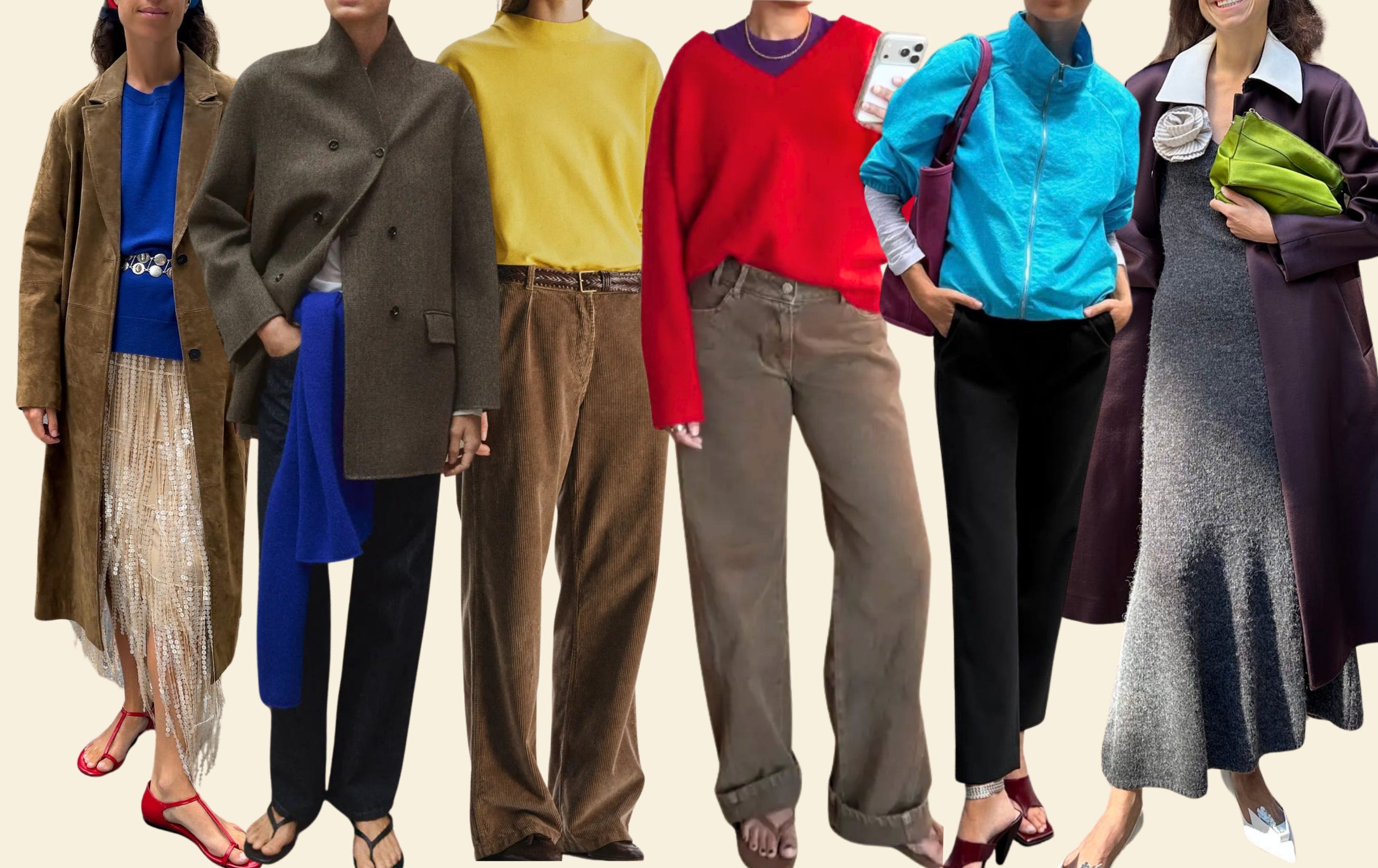
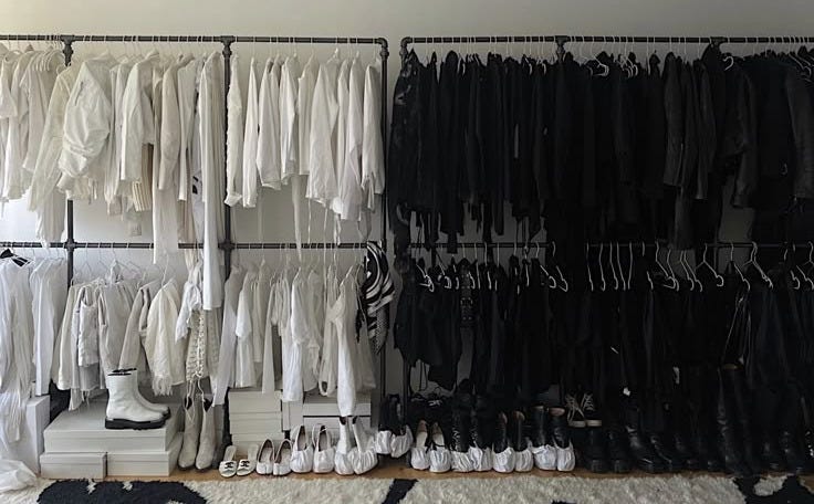
Personally, I’ve been sitting with this newfound collective excitement about color for a while, not really adding much to the conversation beyond my occasional pops of bright blue, to which I felt very entitled as a Greek. The truth is, not wearing much color has always been the easy way out for me. You can’t very easily go wrong when you’re working with a wardrobe of black, grey, white and the occasional navy and brown, and this can be a real relief to an easily strained decision-making muscle like mine.
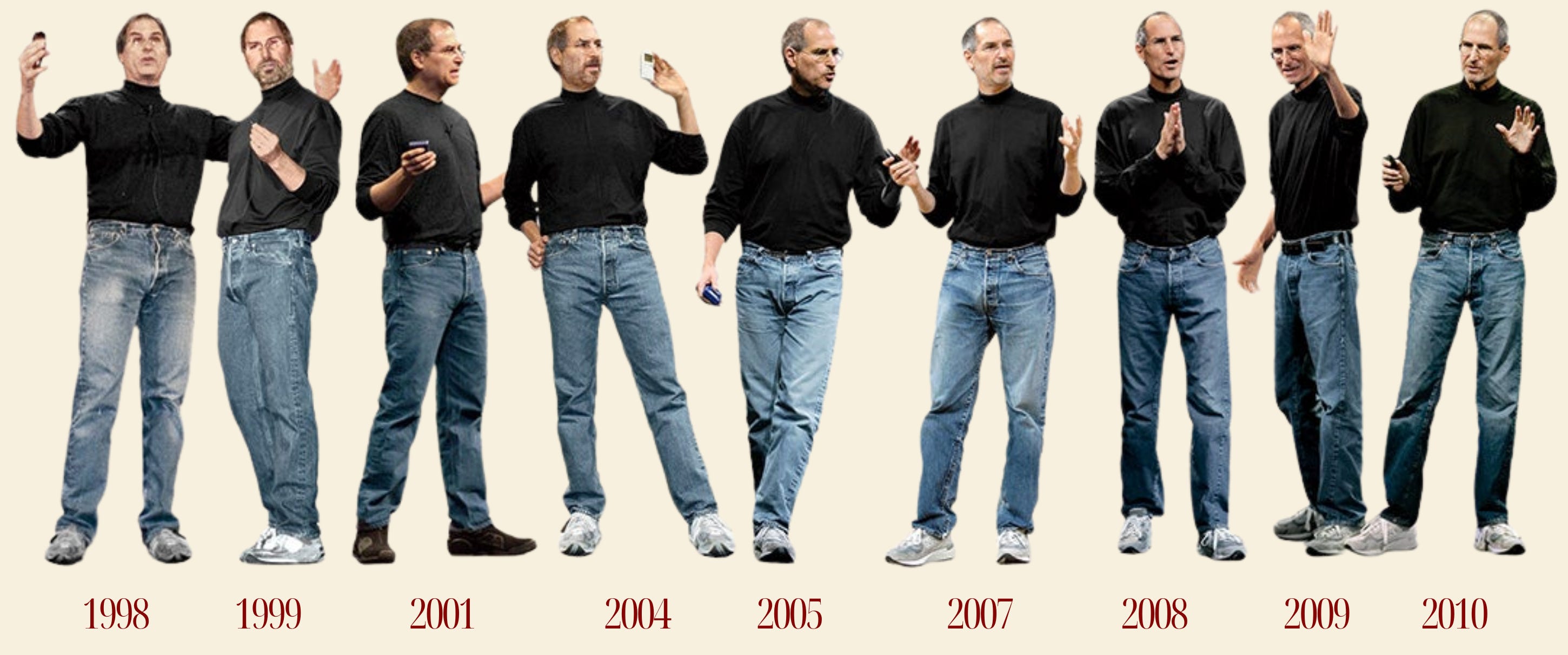
Although I’m feeling wonderfully secure in this palette, I must admit it has put me in a kind of a creative slump. How many new silhouettes and proportions can a woman invent before she needs something completely new and funky to feel inspired again? I’m certainly no brenda hashtag, proudly content to never rewear anything other than black and white (big respect tbh), and although Steve Jobs was definitely onto something with his 100 identical Issey Miyake turtlenecks, I don’t think I have it in me to spend the rest of my life in outfit prison.
I think we’re all feeling a bit intimidated by new colors, but that’s probably because they force you to do the work. You have to observe, spend hours pinning things on Pinterest, nerd out on Substack, study editorials and runways, take notes, try, fail and repeat—a high-effort but also high-reward process we’re getting increasingly unmotivated to maintain in other parts of our lives.
Because chances are, you’re not going to get it right the first time. That colorful jacket you bought because it brought you joy is probably hanging in your closet as we speak, staring at you in desperation as you reach for its black alternative once again. You don’t know what to do with it yet, and that’s okay! There is something deeply human about sitting with your mistakes instead of fixing them instantly: trying things in different ways, figuring out what isn’t working and, little by little, learning what does. Trusting that eventually, all that trial and error might start turning into instinct and, maybe—enfin!—into that highly coveted sense of personal style.
I’m certainly not craving a super colorful wardrobe completely out of the blue (pun definitely intended), but color has given me a reason to look at my clothes with a fresh pair of eyes again. It forces me to pay attention, to actually examine the clothes before buying them. Instead of immediately flirting with the buy button on a colorful item like I would with its neutral counterpart, I feel compelled to first understand why and how the color works, to let the idea of it sit for a minute, to admire others wearing it until I can actually imagine me in it.
Now that I think about it, wearing color is a pretty rebellious act! You lose a little bit of that optimized, à la Steve Jobs, dressing formula, yes, but you gain something much more valuable: time. Time to think and experiment, to be a little less strategic and goals-driven and a little more curious, daring and unpredictable just for the sake of it. If you were French, you’d have a whole vocabulary for it: kiffer, s’éclater, craquer—so many different ways of saying I’m doing this because it’s fun and it sparks something in me, and that’s reason enough.
PARISIANS & COLOR
And this is finally where we get to the Parisians. You’d say, Madame, have you lost your mind? If there’s one nation you wouldn’t necessarily associate with colors—and perhaps even one to blame for our collective obsession with black and neutral palettes—it’s the French (okay, the Parisians). But after a few particularly intense months of people-watching, I’m starting to suspect that their relationship with color can’t be reduced to “they wear so much black”.
Parisians are indeed not the loudest dressers in Europe—Italian or Spanish dressing can offer much more creative lessons in the color-and-pattern department. Their combinations are exuberant, clashing, performative and, for a color newbie like me, very much intimidating:
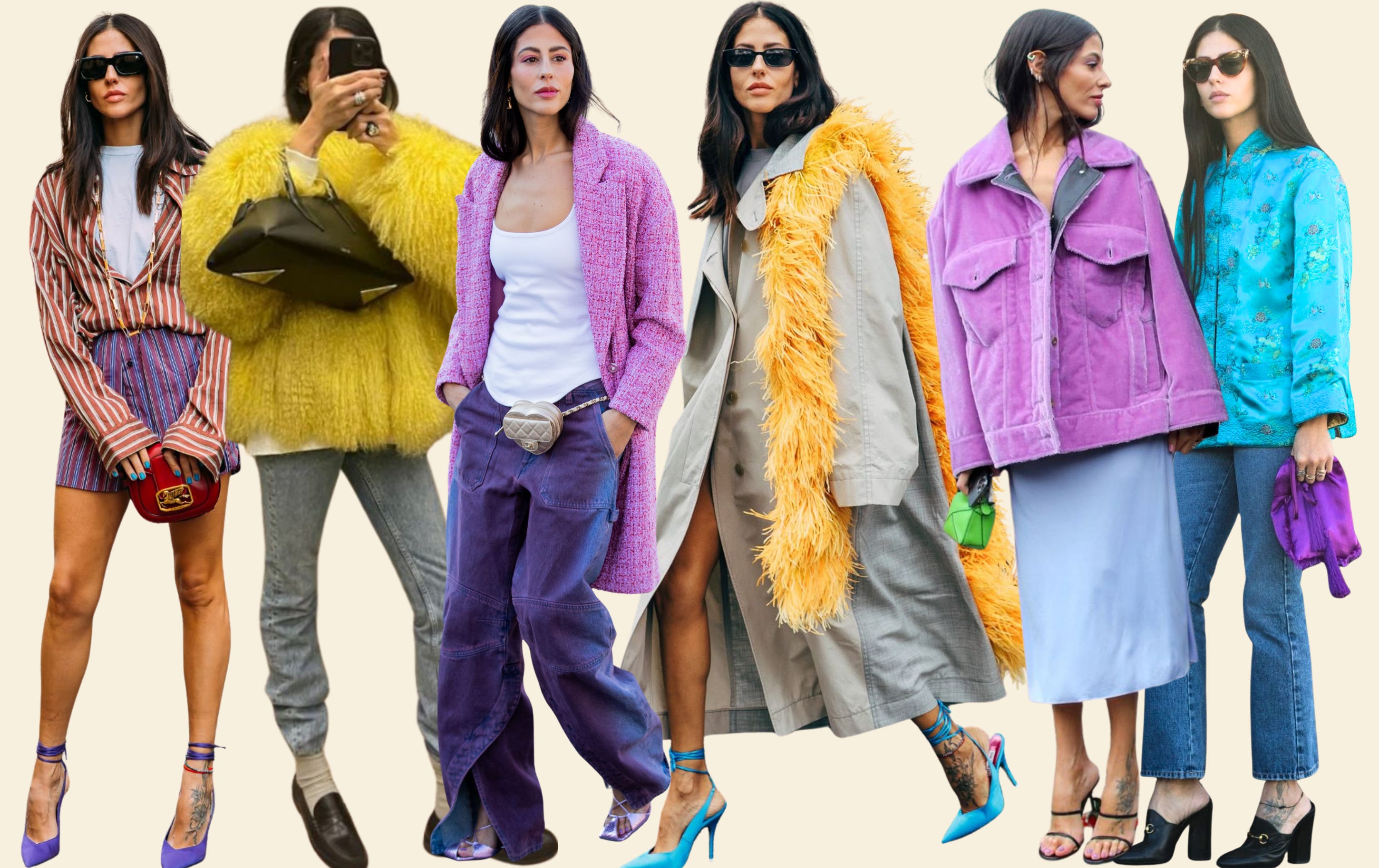
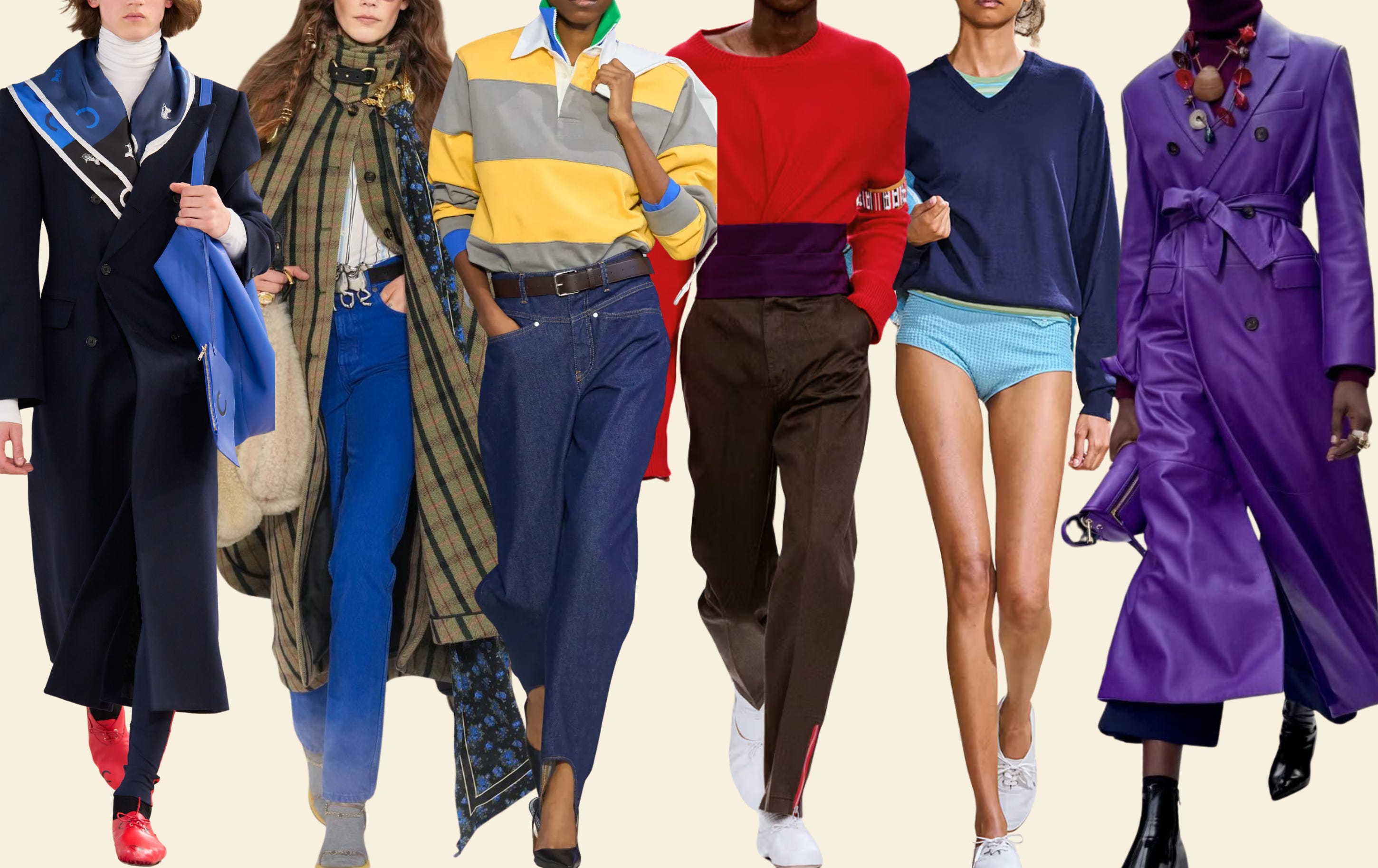
Many of us have been taught to associate color with this if you’re going in, you have to go ALL in approach, but maybe that’s been part of color’s marketing problem all along? With a little help from fresh styling eyes, we might be starting to realize that there is another way to do it—Michael Rider’s styling for Celine might be the starkest example (people went absolutely wild for all that color!)
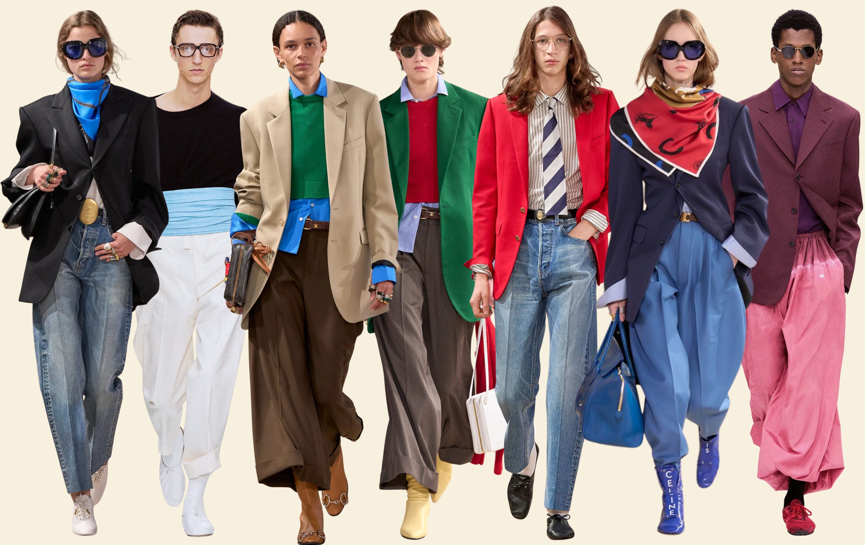
And if there is anyone else, apart from a styling professional, who could make Start Wearing Color 101 feel a little less terrifying and more approachable, well, it’s probably a Parisian. Parisian dressing tends to be more restrained, yes, but not necessarily more neutral. Color is very much strutting down the streets of the Marais, it’s just doing so with a little less fanfare. The trick (and the magic, if you will), as we saw in Michael Rider’s Celine is in everything surrounding the color: the proportions, the shades, the textures, the makeup, the hair, and, perhaps most importantly, the attitude of the person wearing it.
As I started compiling my actual street style evidence trying to prove my hypothesis, I realized I had way more of it than expected—some unpublished photos from last winter, plus a fresh batch of sightings from this month—so I decided this needed to become a series (sans the lengthy intro next time, I promise!). Like Rose Florence’s fabulous secret histories of color, but make it street style fashion!
This is the first installment of my Parisian street reports, in which I attempt to investigate (and maybe debunk?) one of the oldest fashion myths there is: that Parisians do not wear color.
And where better to start than… red, le rouge!! The color that inspired the (very artisanal) visual direction of this newsletter, and perhaps the one with the most convincing Parisian credentials.
Are you ready? On y va!

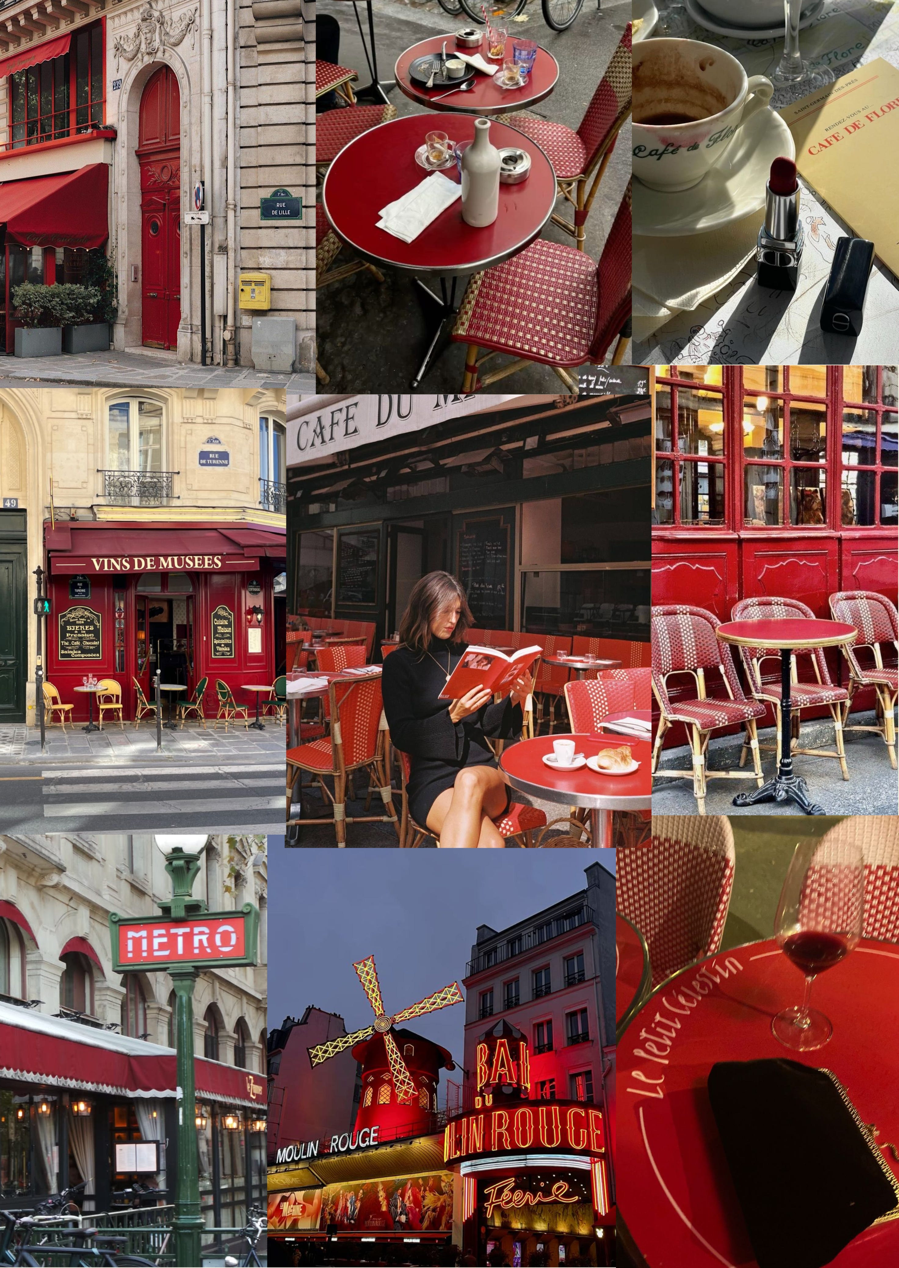
The Moulin Rouge, the iconic rattan chairs of Parisian bistros, the red on Paris’s metro signs, those gorgeous Haussmannian doors, a good glass of red wine, even lipstick being called rouge à lèvres (literally “red for lips”) regardless of the color you choose... red is probably the first non-neutral color you start noticing the minute you set foot in France. Famously tied to the French revolutionary spirit and eventually incorporated into the country’s official tricolor, red was also quickly embraced by French couturiers as a true pièce de résistance for the modern Parisian woman.
From the pared-back minimalism of the ’90s to the flashy 2000s (those iconic Louboutin red soles were literally on every celebrity’s feet!) and our more recent obsession with quiet luxury, red just keeps coming back as one of the easiest ways to inject a little drama without abandoning a classic color palette. Few designers have played with this contrast more than Paris-based Yohji Yamamoto, who has long used red as a striking counterpoint to his black-and-white aesthetic. (Fun fact: he was fascinated by the work of French couturier Madeleine Vionnet, whose sleek bias-cut dresses and use of red had Hollywood absolutely drooling in the ’30s!)
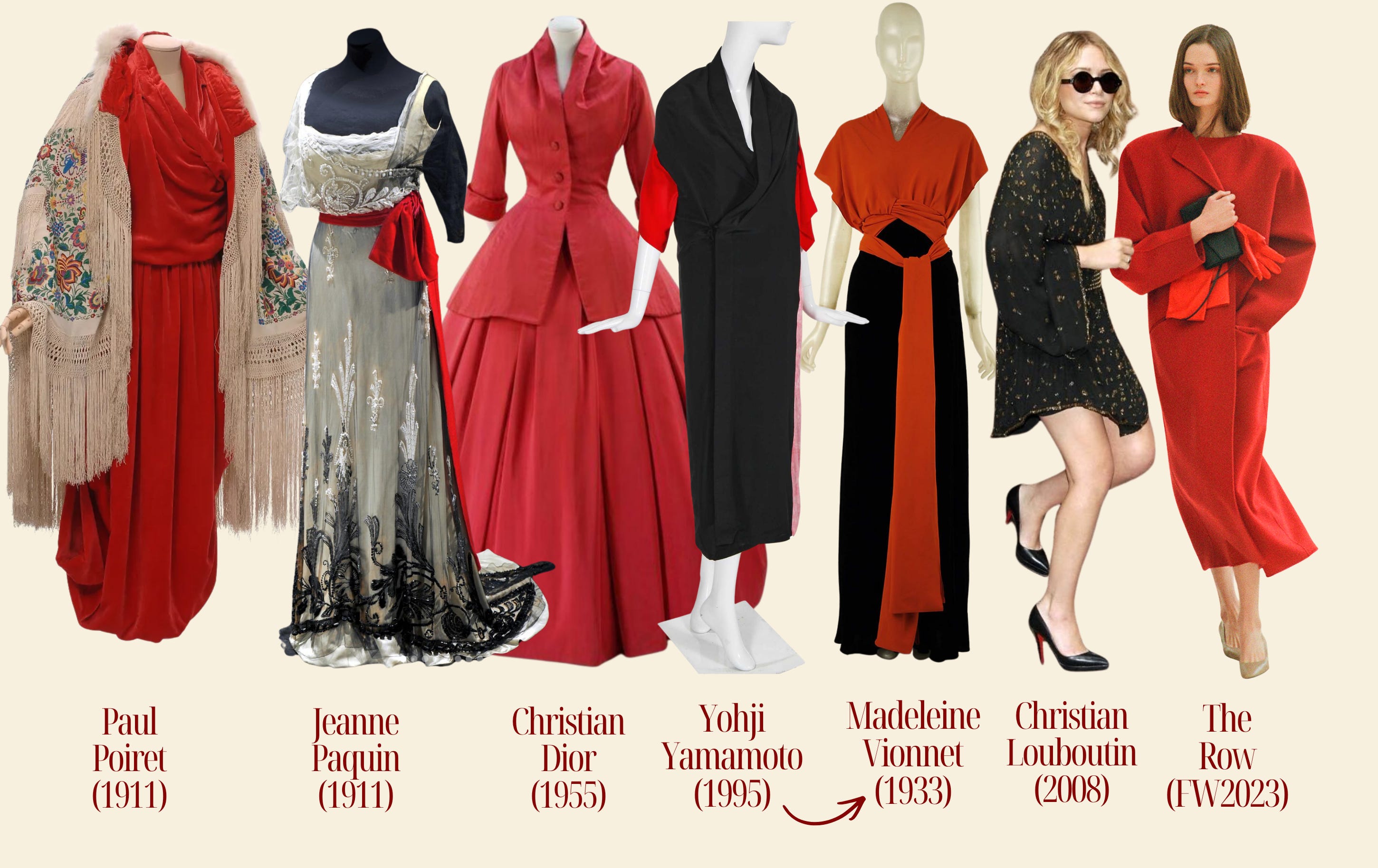
OK, theory is great, but what does all of this mean for you and me, who might be mesmerized by a good piece of red clothing (re: that The Row FW 2023 coat is still living rent-free in my head) but don’t necessarily want to become the very center of attention every time we step outside? I personally find a small pop of red almost anodyne when it’s on my lips (it’s a classic!) or shoes (the streets have convinced me!), but I do get a little self-conscious when it starts extending to bigger areas of my outfit.
But minimalists are relying on red for a reason, and after diving deeper into the way Parisian women wear it, I realized that the secret is all about finding that sweet spot between the right shade, the right texture (it can make all the difference!), and the right supporting palette and proportions—enough to make red feel like a confident little statement, yes, but without making it feel like you’re begging for attention.
As you’ll see, French women have plenty of tricks up their sleeves—off to Pariii we go!
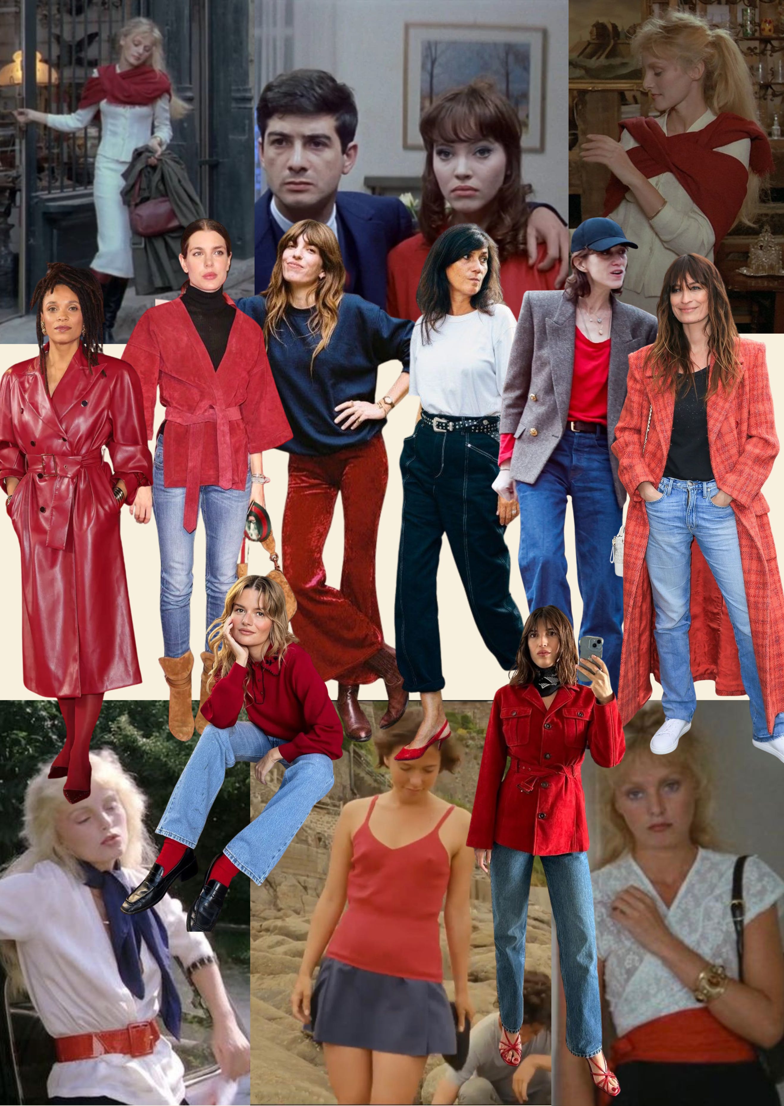

Pour commencer: red is no longer (just) sexy
For the longest time, red was associated with a pretty specific vibe: Sexy or ultra feminine, a little mysterious, a bit theatrical. Parisian it-girl Jeanne Damas and her entourage are a good representation of this aesthetic: fitted tops and jeans, open necklines, red lips and nails. The look on the left isn’t too far from that formula: red is close to the body, the proportions are quite tight, red itself comes to accentuate your femininity.
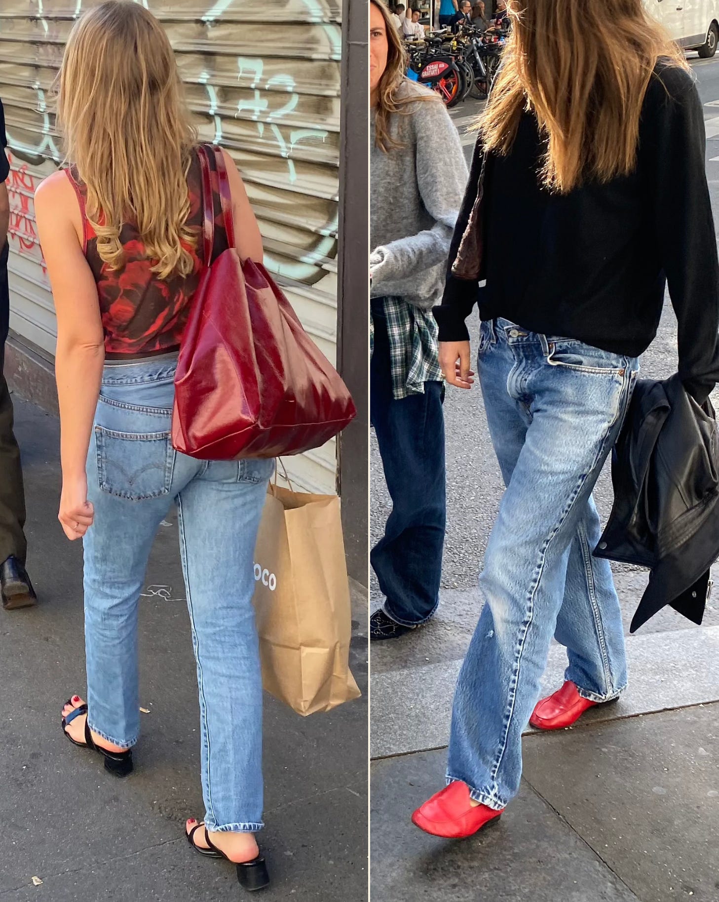
But the red I’m noticing most on Parisian streets has been feeling noticeably more relaxed, just like the look on your top right: baggy silhouettes, menswear-inspired pieces, loose denim and generally less emphasis on the body. The looser styling makes red feel more casual and versatile, which is probably a big part of why it feels so fresh and coveted right now.
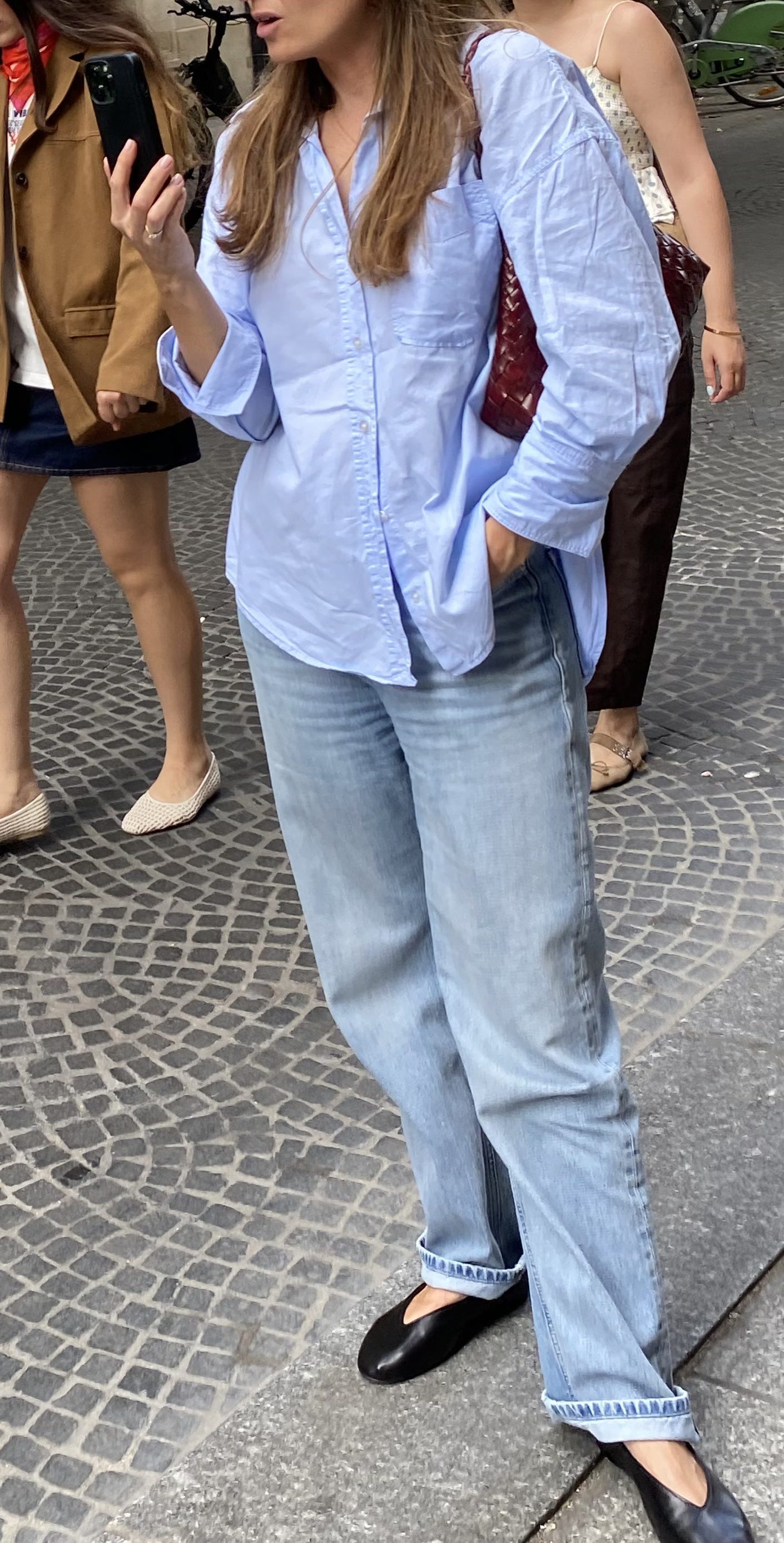
Same goes for this next outfit—the crumpled blue shirt and rolled-up jeans mess with the femininity of the sleek ballet flats and burgundy bag:
A pop of red on a black & white base (+ a little texture!)
If you’re not ready to commit to a red garment this is probably the easiest place to start: add a pop of red through one accessory and keep the rest of the outfit black and white.
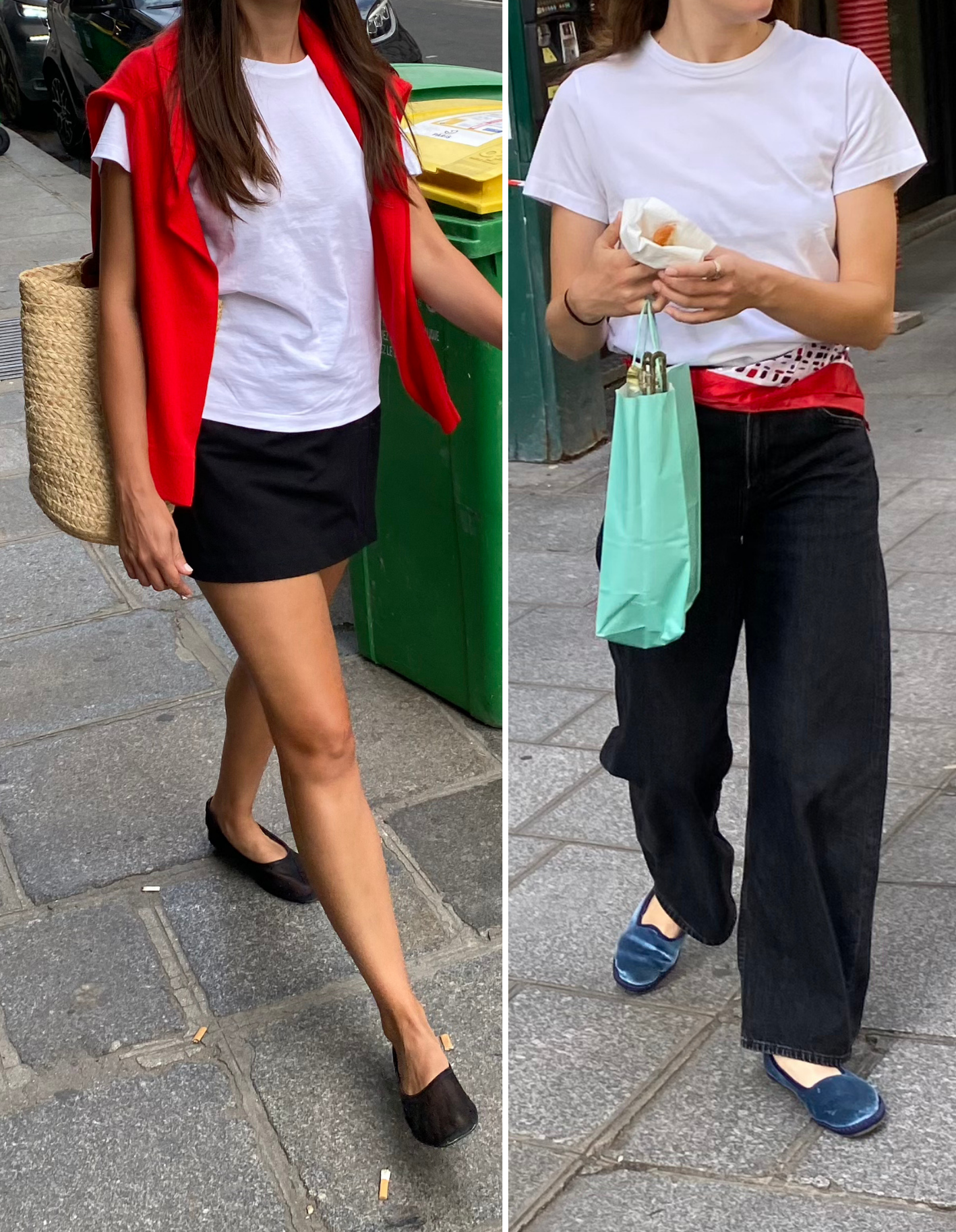
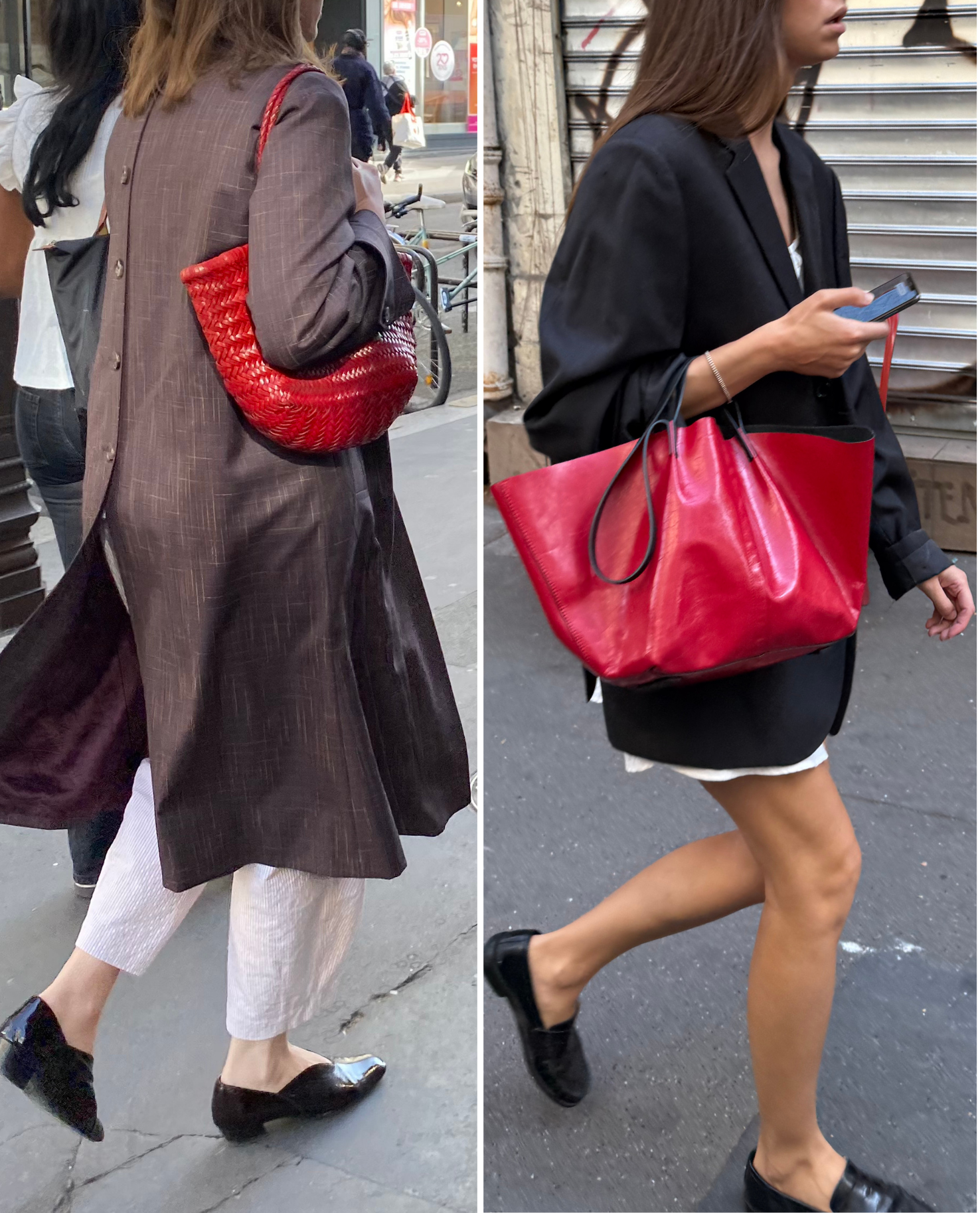
Looking through my camera roll, I realized how often this same formula kept appearing: red shoes, a red bag, a red scarf or a sweater draped over the shoulders on a black and white canvas. Something relatively small that acts as the visual interruption between the black and the white, the little thing your eye lands on first.
And then there’s usually some additional texture thrown into the mix: a woven bag, mesh flats, velvet shoes (I love how the blue completes the French tricolor in the top-right outfit 🇫🇷 ). These kinds of textures keep things from feeling too flat without introducing yet another strong color.
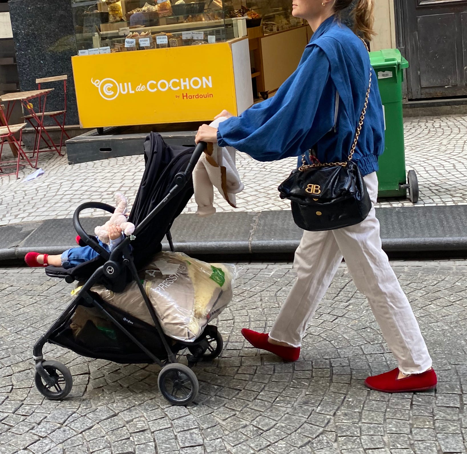
Blue also comes up quite a lot as a way of completing the black-and-white palette. In this outfit, for example, the red stays on the bottom while the black comes in through the middle via the Balenciaga bag, with the blue jacket tying everything together. (And btw, I CAN’T with the matching red flats on the baby. Even the French cannot resist a little coordination moment!)
A red bag on a darker base
This is probably the most traditionally French version of the formula: dark coat or blazer + dark bottoms + red bag.
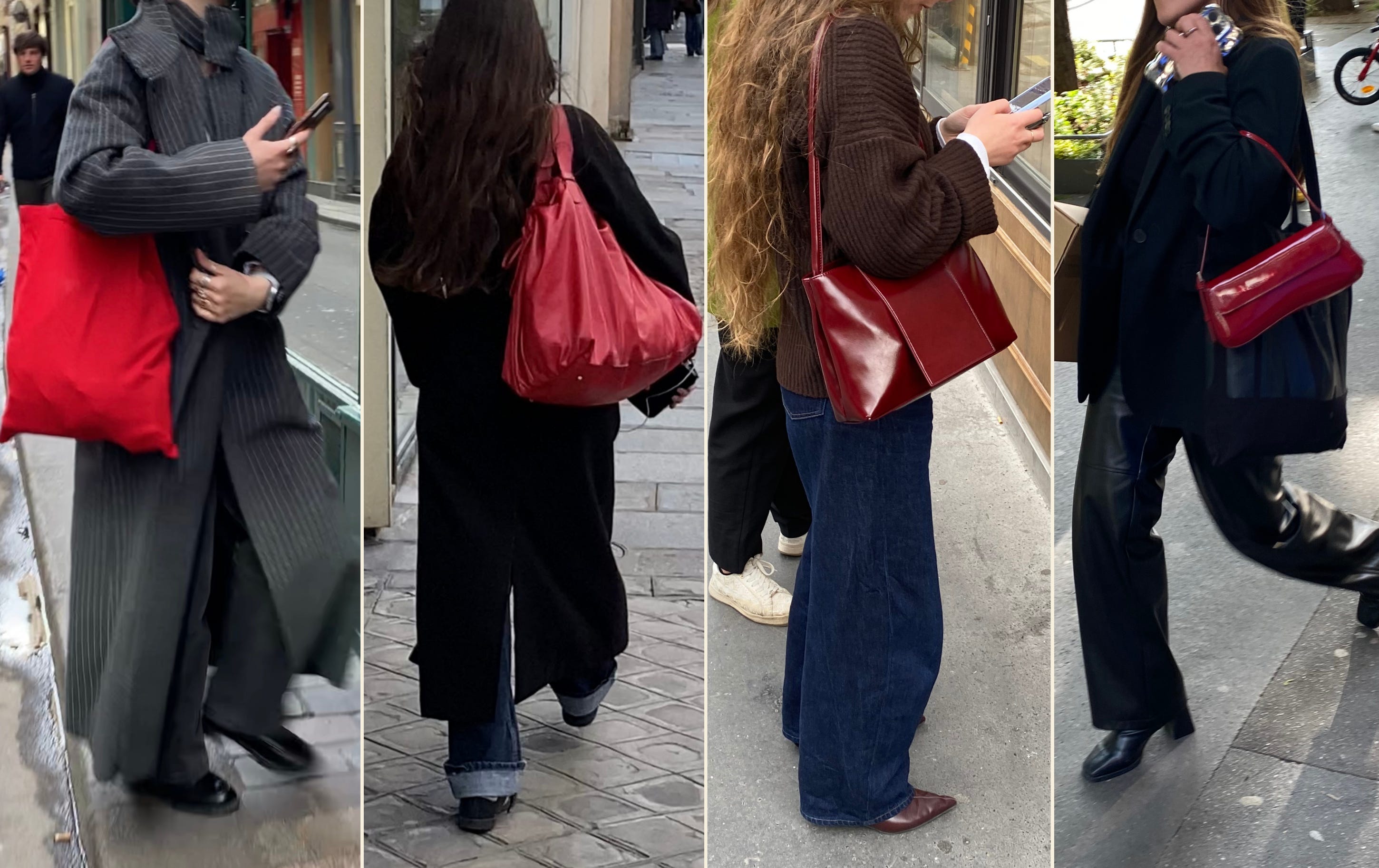
This is a particularly useful formula for fall because you don’t have to buy an entire new outfit around the red. Your jacket, jeans and shoes can all come from the wardrobe you already have, and the bag is the little va-va-voom element that comes in the middle to brighten up all that darkness.
This is also a great moment to play with texture: if you’re into the minimalist/Yohji/The Row aesthetic, keep the bag matte—a simple red canvas tote like the one in the top left can do the trick (here is the more luxurious version).
I’m very into the idea of doubling down on the leather with a pair of pants like the look on your top right, landing somewhere between Parisian casual and Saint Laurent baddie.
And if it gets too dark for your taste, you can always add a little pop of white underneath:
Red bottoms on a black and white palette
Interestingly I’m still seeing the same black-white-red combination, but this time red gets a little more real estate.
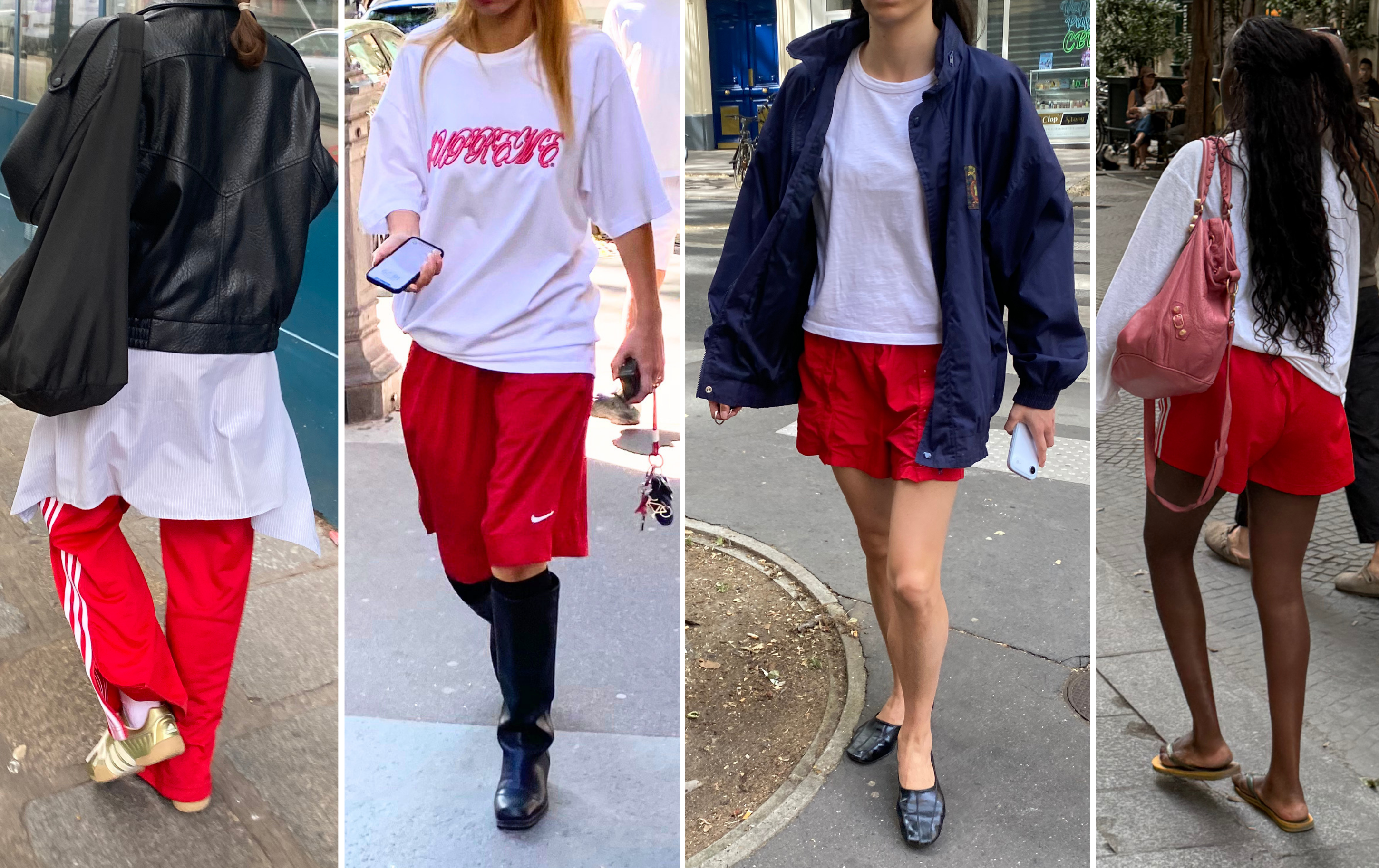
There’s still a little window to get some wear out of your shorts, and this is exactly the kind of in-between-weather dressing that makes it possible: pair them with a white slouchy long-sleeve, throw on an oversized navy or black leather jacket, add some ballet flats or loafers for that sporty-chic contrast and voilà!
You don’t have to stick religiously to black and white either. A muted pink (basically red but softer), navy, brown and other neutral-ish shades can all play the same role. The idea is really about giving the red something relatively quiet to sit next to.
One thing that kept coming up in almost all the previous looks: the red often sits physically closer to the white than to the black. That’s a useful little styling trick if you find red and black too dramatic together (Yohji Yamamoto would respectfully disagree).
A pop of red with browns and khakis
There was quite a lot of this combination around Paris last winter, and with khaki pants having their little renaissance right now, my guess is that we’ll be seeing even more of it this fall.
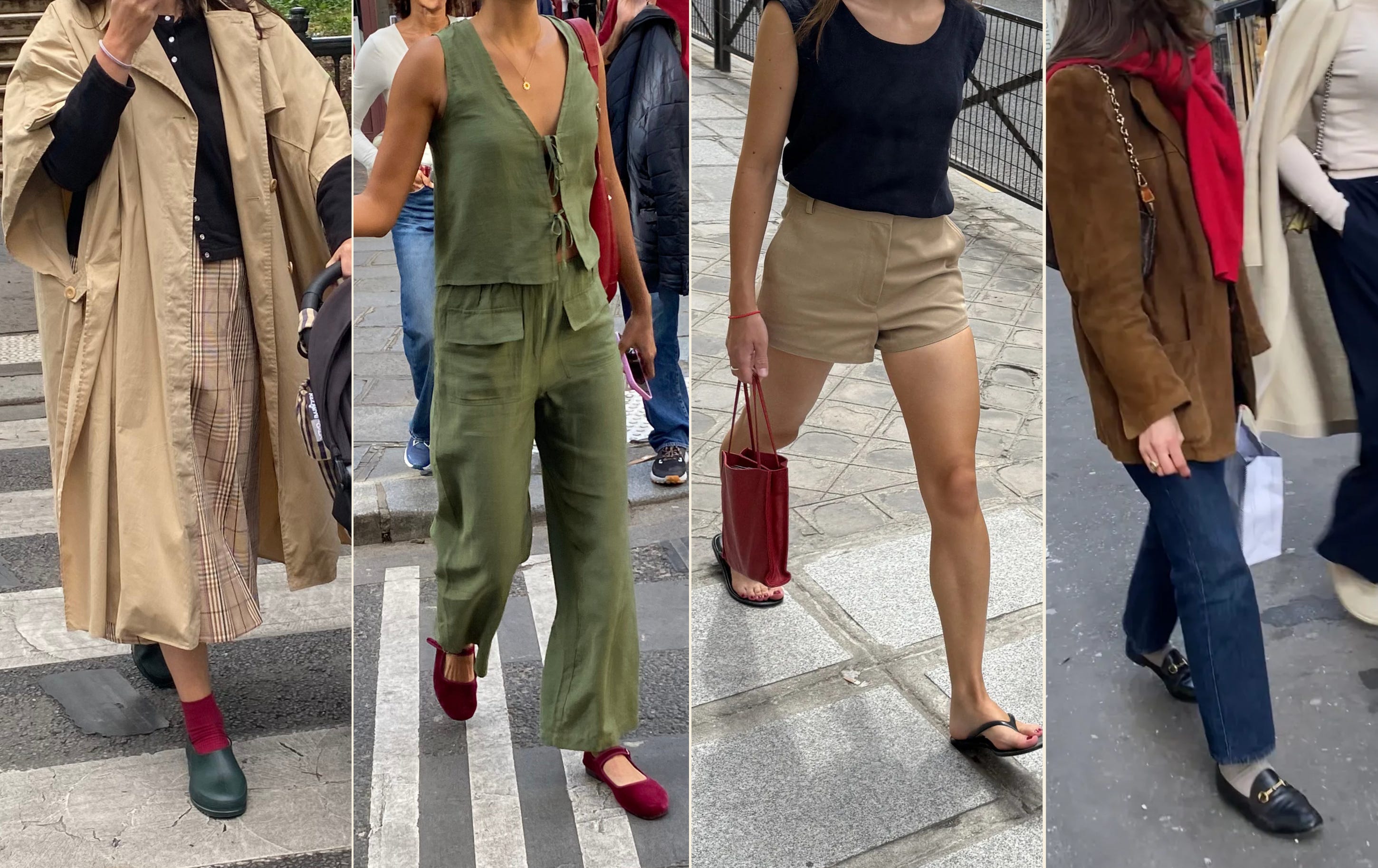
What I see most often is red used as a discreet but impactful pop: a red sock with green clogs, a red ballet flat with a matching red bag, a red bag against a more neutral navy and beige, a red knit draped over a brown suede jacket.
It also works particularly well with the kinds of fabrics that start appearing more in fall: suede, leather, wool, corduroy. Red gets a little softer when it’s surrounded by all those earthy textures.
The shades of brown and red matter! As you can see from these looks, a warm chocolate or khaki creates a very different effect against a deeper red than it does against a brighter one.
The supporting colors and proportions can make all the difference too—case in point: this outfit spotted in the Marais, which I already know is going to live rent-free in my head until I recreate it this fall. (No surprise she landed at the very hip Café Charlot):
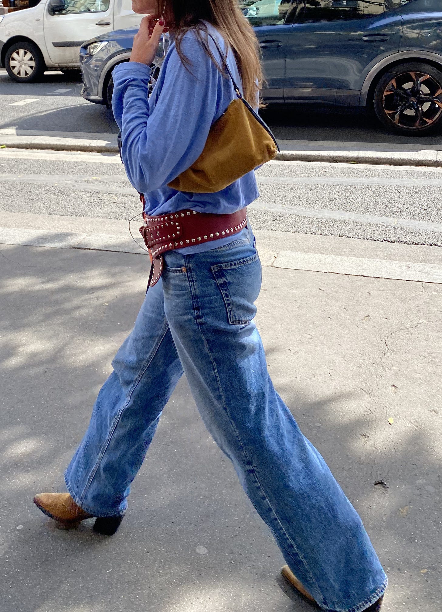
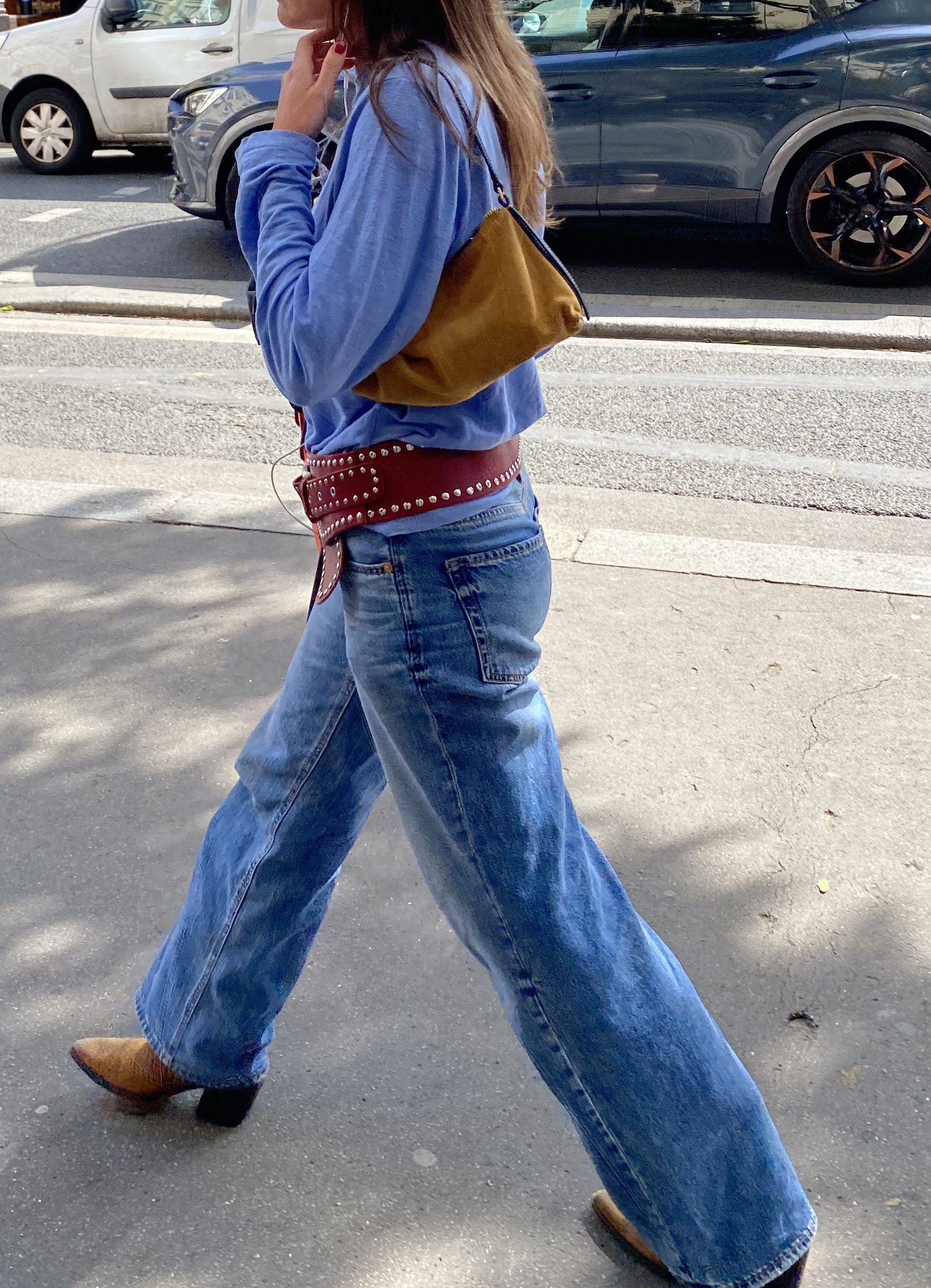
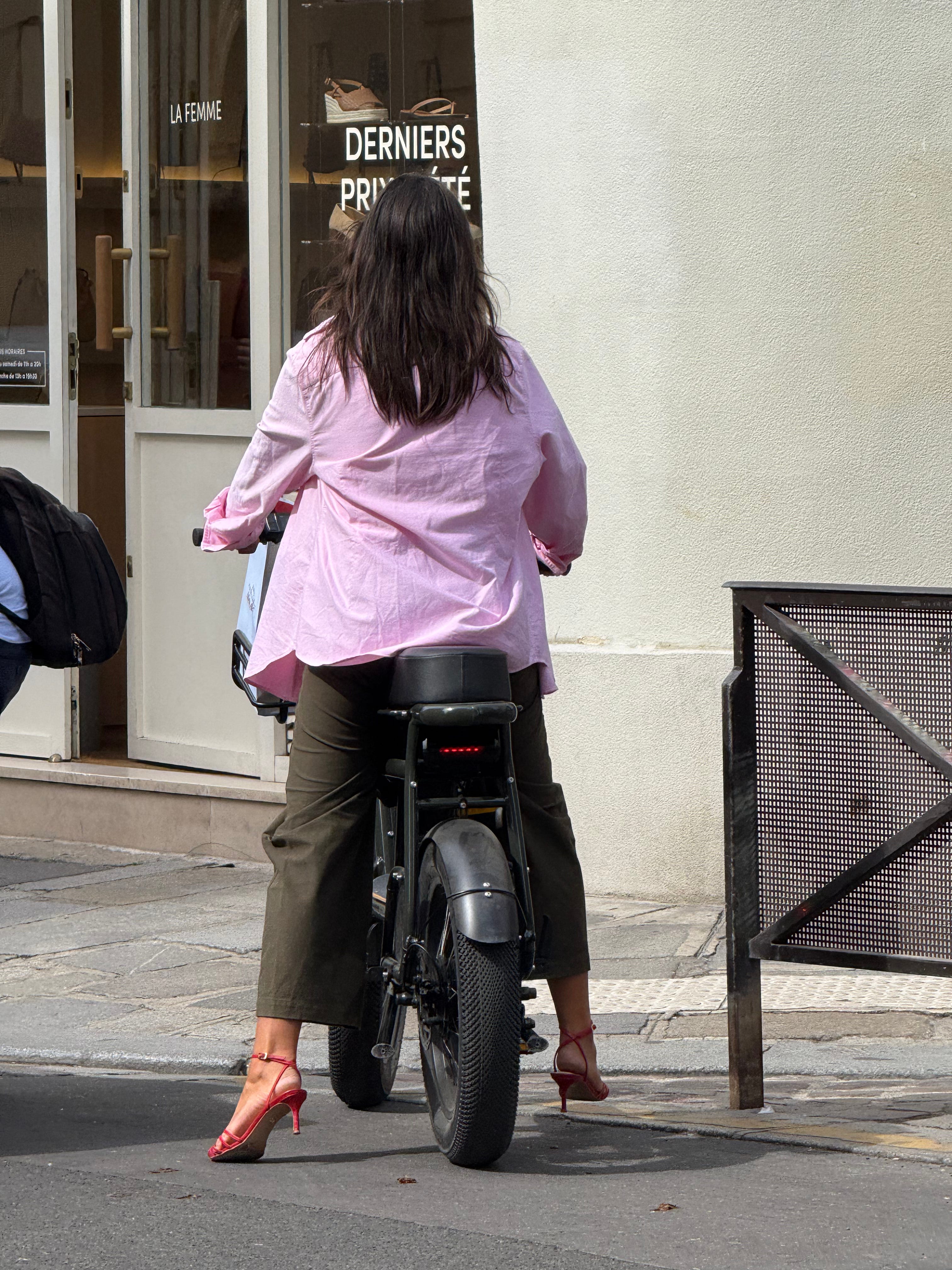
The slouchiness of the tee and its perfect shade of blue (this one has a similar slouch)! The camel baguette with the black leather trim (old Mango, similar from APC)! The matching suede cowboy boots (another French hero item!). And then, for the grande finale, the studded red belt which I genuinely can’t imagine styling better than this (you can still grab it on Poshmark). And s’il vous plaît, one minute of silence for Her Majesty of Parisian Fabulousness riding a motorcycle in her red heels and cargo pants:
Red as the star of the show
And in case you were wondering: oui, there are a few times when red is not just the supporting actor and gets the right to become the main event:
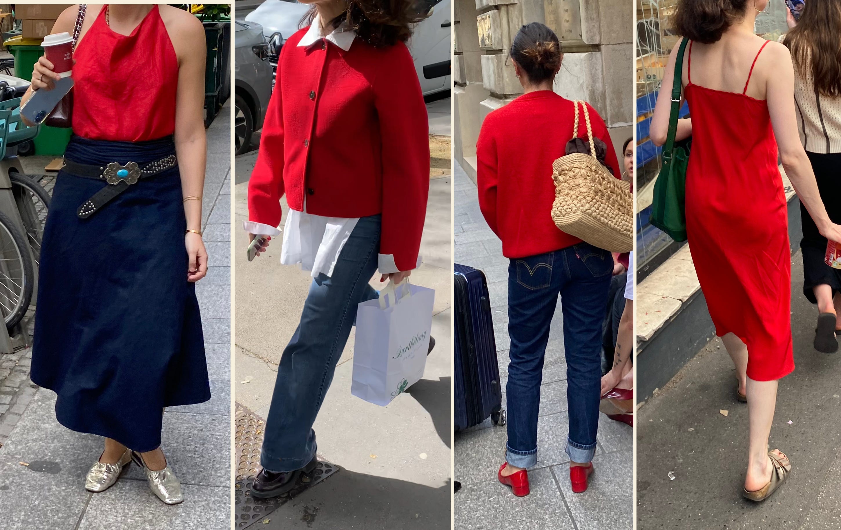
Interestingly, when red takes up this much space, Parisians tend to go for it at its brightest. And as you can see, all these outfits still have something décontracté about them. That’s really the key: let the red do the talking without making the rest of the outfit feel too calculated. A loose red dress with Birks (notice the look on your top right—I see this combination a lot!), a red jacket thrown over an oversized white shirt, a red cardigan paired with the straw bag you’d normally reserve for the beach. The easiest way to make it work is not to overthink everything around it.
The different textures can make all the difference once again! The shiny silver flats and studded belt in the outfit on the left make the whole thing feel much more cool girl and much less je suis une femme fatale.
As for supporting colors, I see it paired with navy quite a lot, either in the form of a skirt or, even more often, indigo denim. I also love it against that deep green Louis Vuitton Noé bag on the right (here and here at an excellent price!).
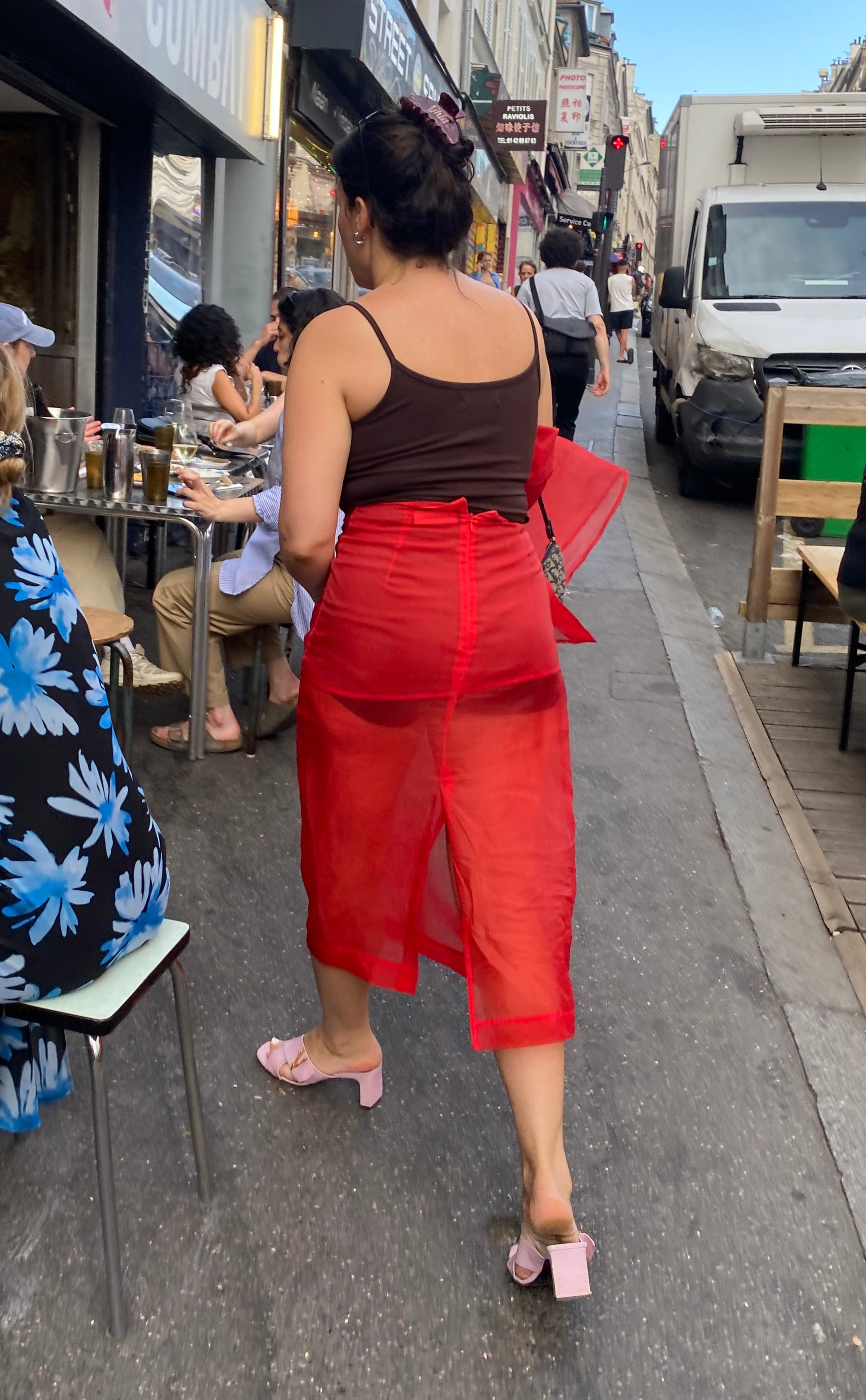
Aaaand pour le grand final here’s one of the most show-stopping moments in red I’ve spotted in an otherwise pretty understated neighborhood (the 19th arrondissement): a sheer matching chiffon shirt-and-skirt set from The Frankie Shop, fab Versace heels and a Dior Trotter shoulder bag! The pieces are obviously statements on their own, but the messy updo and that Ghia hair clip keep the whole thing from feeling too fashion victim-ish:

Et voilà, that’s all for today! I know that this was LONG but I hope you’re leaving with a renewed appreciation for red and hopefully a couple of ideas for how to wear it yourself, the French way!
Keep this little report handy as a cheat sheet for the next time you’re wondering what to do with that red show-stopper in your wardrobe. Oh, and which color should come next? 🤭
See you on Sunday!
Biisouus,
Frosso


Another masterpiece ❤️❤️❤️❤️
Green next maybe?
I would love to see yellow next! A color I am always interested to see how people style